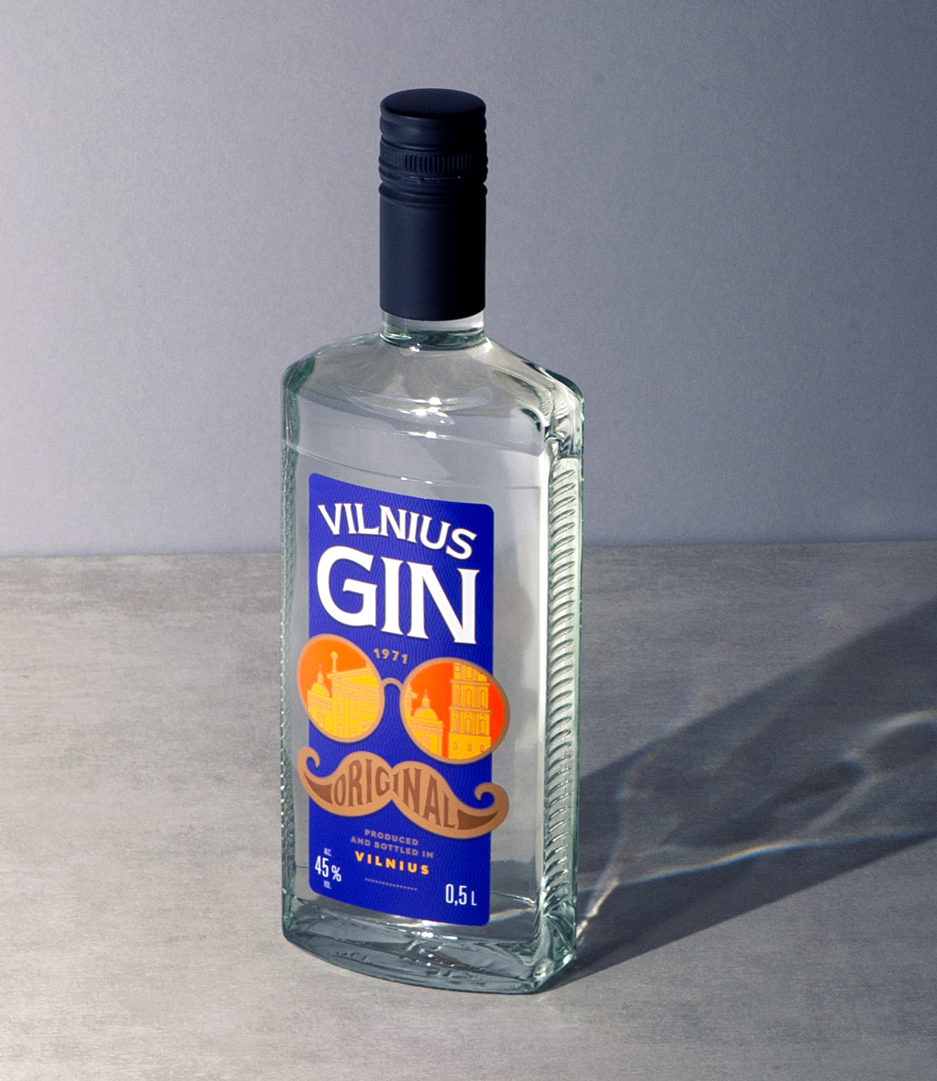
Vilnius Gin: Story of a City
Vilnius Gin was created around 50 years ago and was one of the symbols of the popular culture of Vilnius in the 70s.
The redesign project aimed to bring the brand to its roots and recreate a feeling of the 70s’ in a way that both traditional lovers of the brand and new generations could appreciate.
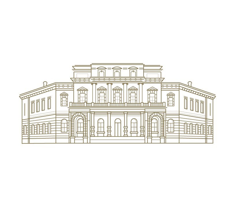
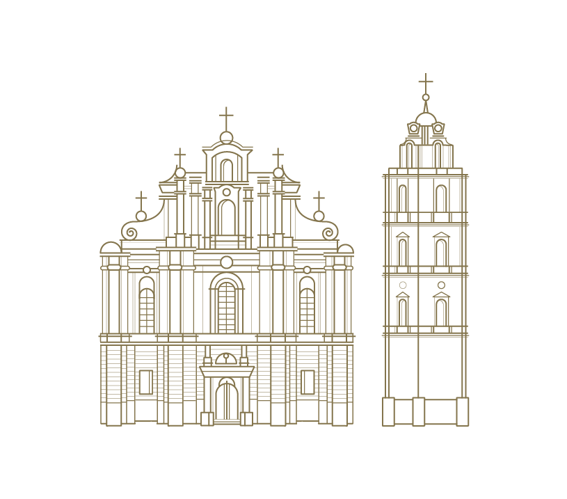
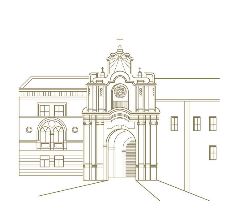
Our solution was to use both sides of the bottle. The front received a bold improvisation of 70s design and the back tells the city’s story. The front label creates the outlines of the human face and stresses the fun part of the brand. We used various printing techniques to make the contrast and depth as strong as possible.
Front Label

Back Label

Illustrations


Notice: Trying to get property 'post_title' of non-object in /home/socialus/domains/havascreative.lt/public_html/wp-content/themes/zex/single-projects.php on line 277

Thank You!
Your application has been received.
Your CV will be reviewed. We will keep in touch with you via email if we see that you meet our requirements.
BACK TO HOME PAGE